
Md. Monir Hossain
Power BI Developer
Lead Generation Expert
Sr. Software Developer
Md. Monir Hossain Portfolio
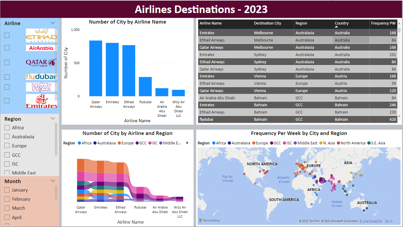
Airlines Destinations
Based on an Excel database table containing the following ( airline name / airline code / country / destination/ region / frequency per week )
Basically 6 airlines with their weekly frequencies to the city destination
So my idea is to have the following ( filter region and month ) and the maybe do like filter or buttons for the airline using airline logos as the button or the filter.
Then maybe have a graphs, a table and a map on the side. maybe a ranking on the side as well
For the table we can do/ region / country/ destination / airline / frequency per week
If possible to have the airline name as the logo and just click at the logo.